
- How to create Plotly animations
- How to save Plotly animations
- How to create Mapcharts – Plotly & Mapbox
- How to create Matplotlib animations
- How to save Matplotlib animations
- Titles, Axes, Ticks & Legend
- Matplotlib Built-in Styles
- Animated Line Charts
- Multi-line Animation
- Stacked Area Charts
- Word Cloud Visualization
- Bar Chart Animations
- Colors with Python
- Creating Multiple Charts
- Creating Hexbin Charts
- Creating Pcolor Charts
Guide to Python Animations: Animating Line Charts

I simply love Python animations and I’m very excited to share with you this “how to create animated charts” tutorial.
Python animations may seem a little complicated at first, but rest assured it’s nothing you can’t crack. We will divide the process to a couple of pieces and simplify each step in this tutorial. Once you understand the underlying logic you will also be the king or queen of Python Animations  in no time!
Let’s start with a brief introduction and then build the case.
Note: This tutorial is suitable for beginner, intermediate and advanced level Python programmers. However, you will need to have an understanding of Python loops, User defined functions and Python data structures such as lists.
Introduction
Python animations can be very helpful in visualizing data in even more elaborate ways than still charts. If color codes add a 4th dimension to charting options (with x, y, z coordinates), it can be said that animation adds a 5th dimension which is movement in time.
In this animation tutorial we will use Python and Matplotlib to animate line charts. We will also try to explain every step so clearly that every analyst and coder can clearly understand “How to create line chart animations with Python“.
Furthermore, this technique can help data analysts, data scientists and startups communicate the findings of their data projects much more elaborately. It can also tremendously help teachers and professors with Python and coding related material to help their students gain high quality technical knowledge in simple steps.
Let’s start!
1- Preparation
It makes sense to know and understand the prerequisitions for having a Python animation:
- Libraries: First we need to import libraries
- Data: We also need data
a) Matplotlib and Seaborn
Seaborn can be helpful for creating quick and beautiful charts. It’s based on Matplotlib which is the main engine of pretty much all charting done in Python. Before we start the animatin work you can import them as below:
- import matplotlib
- import seaborn
b) Data
Secondly, we need data obviously. Data should be in some kind of sequence format. It could be any of the Python sequences such as range object, zip object, map object, filter object, list, tuple, dictionary, Pandas Data Frame, Pandas Series or Numpy Array. Also data can be resources from a combination of these sources. i.e.: mixing range object (x-axis values) with a list (y-axis values).
c) Ipython viewing options
Also, just a quick note. When we run our Python code, it is expected to create a visual. (chart or animation or animated chart if you will). It can be important to decide where this window will appear. You can use the magic commands below to control the environment where your animations will be shown once code is executed.
- %matplotlib qt: Uses external window for visualization
- %matplotlib inline: Plots in the embedded plot pane
- %matplotlib notebook: Jupyter standard
Magic codes can be inserted inside the code when using Jupyter or editors like PyCharm, Atom or Visual Studio Code. You might as well execute them directly in the console of IDEs such as Spyder and your preference will be noted.
These magics might be helpful when your plots, charts or animations are invisible or when they are freezing. But there can also be other problems especially if they are freezing.
*Magics are kernel features that can be used to control coding environment and kernel behavior. Rather than being part of your code it’s more of a command that supports it.
- Line magic can be done with single percentage sign in Python: %
- Cell magic can be done with double percentage sign in Python: %%
cell magic will convert the whole Jupyter cell or Spyder cell into magic command including all lines in the cell and it’s less commonly utilized than line magic in general.
2- Components of a Python Animation
FuncAnimation can be used to create animation objects in Python. Here is a simple code sample for creating an animation using FuncAnimation:
anim = FuncAnimation(fig, animate, interval=100)
This most basic way of creating Python animations requires 3 components. These components work in harmony. They are:
- figure: Chart object (using matplotlib.pyplot or another Python plotting module). This is the figure structure where animation will take place. Most significant setting here is probably figure size which also affects the output file when animation is being saved later. For more options on saving as gif, mp4 or even avi files refer to the matplotlib tutorial below:
- How to save Matplotlib Animations
- figure creates the blueprint for one single chart. Step 2 establishes the function that creates each frame in the animation. Step 3 is the ultimate step that combines charts with each frame and outputs a proper animation object that can be viewed or saved.
- animation function: This needs to be a function that animates a chart. Every iteration of the function will construct 1 frame of the animation. Function for animating each frame (An iterating function we create).
- interval: This is merely a value you assign to interval parameter. It controls the speed of your animation.
Most people are already familiar with figure part from still charts and interval is simply a number value which leaves us the animation function.
Component 2, Function for animation, is the step that’s most confused even by experienced coders but it’s actually nothing complicated. See below for a clear explanation and demonstration.
Once you conquer the animation function part the rest will follow.
3- Line Animation Example
Let’s create an animated line chart and practice the animated charting skills mentioned above.
a) Libraries & Data
First, libraries:
import random
import matplotlib
from matplotlib import animation
import matplotlib.pyplot as plt
from matplotlib.animation import FuncAnimation
from itertools import count
%matplotlib qt
Then, data. Here we are creating a random sequence for y values and a range of values for x.
We are also initiating x and y as lists. Think of y1, t, x and y as buckets. x and y are empty buckets and we will drip information to them from existing full buckets for the animation. Each drip will represent one frame of the animated line chart. See the animation function in next step to see this in action.
y1 = [random.randint(0,4)+(i**1.4)/(random.randint(10,12)) for i in range(0,180,2)]
t = range(len(y1))
x,y=[], []
A Simpler Version of Chart Values
If this is still confusing for you here are a couple of ideas to try and simplify things further.
-Print y1 and t. Once you see what these sequences consist of it will be easier to understand what the animation will be like
-Another option is to use a simpler sequence. Try something like these values to start with and build from there. Here are example Python lists for x and y axes:
y1= [10, 20, 40, 30, 50, 100](y-axis values)t= [1, 2, 3, 4, 5, 6](x-axis values)x,y = [], []
Best way to understand is to play around! Realize that both x and y axes end up with same amount of data.
b) Fig: Chart Figure
At this step we initiate the chart figure and it’s pretty straightforward.
- Feel free to adjust the figure size. This can be important for viewing, computational resources and later saving purposes.
- We’re also creating an axes subplot object since we will make some adjustments to the axes later.
fig = plt.figure(figsize=(12,8))
axes = fig.add_subplot(1,1,1)
c) Func: Animation Function
Below, you can see the animation function. This function iterates for each frame of the animation. We named the iteration variable i. Each i step will be a frame.
- scalex: This is important to set to True because it will scale the x-axis if need be.
- scaley: can be important to set to True as well, it’s the same as scalex but it will scale the y-axis.
- color: If you don’t set the color for line plot in the animation function, you will get electric results color wise. This is because color of your line will be set randomly for each frame.
def animate(i):
    x.append(t[i])
    y.append((y1[i]))
    plt.plot(x,y, scaley=True, scalex=True, color="blue")
We are pretty much done and have all we need. We can now create an animated chart using FuncAnimation.
d) Fig + Func = Animation Object (FuncAnimation)
ani = FuncAnimation(fig=fig, func=animate, interval=100)
#ani.show()
Note: You can find the full Python code at the bottom of this page.
There are a couple of things to fix here.
Firstly, axes are moving and it’s pretty distracting. Moving axes (or scaling or updating axes) can be useful in some cases but in a lot of cases you will also just need fixed axes and only line to move (or bar or scatter points).
In the example below, we will fix the axes for a better presentation.
Viewing the animation
Most IDEs already show the chart or animation object automatically as they are created. If not, try uncommenting the ani.show() part.
Also if you print the animation object you will get the following output:
<matplotlib.animation.FuncAnimation object at 0x000001BC493957C8>
This means it’s a FuncAnimation object which belongs to matplotlib library’s animation module stored at the given memory address in byte format.
4- Example 2: Animated Line Chart with Fixed Axes
In the animation example we have seen the fundamentals of animating charts and plots using matplotlib library and Python. Let’s create another example where we control certain aspects of the animation:
- – fixed axes (by the way axes is plural form of axis)
- – setting axis limits
- – controlling the color of the line chart at each iteration.
Python code lines we will introduce to optimize the animated line chart:
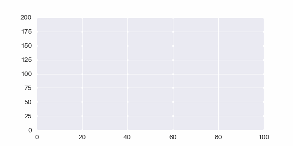
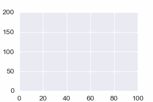
fig = plt.figure(figsize=(5,2))
axes = fig.add_subplot(1,1,1)
axes.set_ylim(0, 200)
axes.set_xlim(0, 100)
plt.style.use("seaborn")
Most important addition here are:
- set_ylim method: to set a limit for y axis and make it fixed
- set_xlim method: to set a limit for x axis and make it fixed
Also, let’s set the line color to green for a change and above we are using matplotlib.pyplot with built in style: “seaborn“, which creates a beautiful blue-grayish grid as background. You can see a full list of matplotlib styles below:
def animate(i):
    x.append(t[i])
    y.append((y1[i]))
    plt.plot(x,y, scaley=True, scalex=True, color="green")
Animation function with color change.
5- Example 3: Animated Line Chart with Moving Axes
Just by incorporating an axis lower upper limit adjustment in our iteration we can also make the axes move. For information regarding xlim or ylim functions which are used to adjust axis upper and lower values you can visit:
Moving axis can be useful in many applications where data stream is continuous and chart needs to be dynamically updating to catch up with the most recent and relevant data values.
Examples that come to mind are:
- Financial Markets and Asset Prices
- Heart Rate Monitors
- Health Data
- Activity Data
- Seismic Monitoring
- Temperature, Humidity Monitoring
- Land, sea and air traffic
- Geolocation Updates
- Orbital Position Updates
Let’s make an example with it:
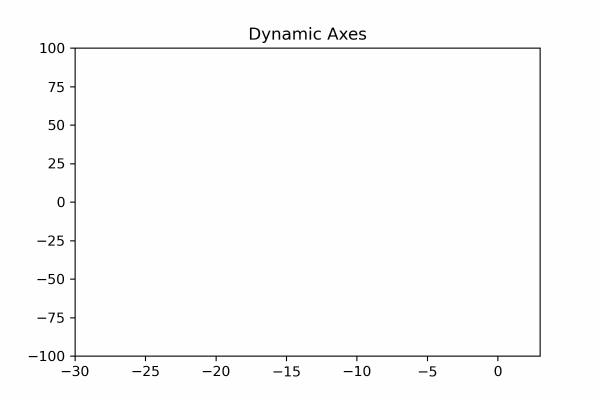
import matplotlib.pyplot as plt
from matplotlib.animation import FuncAnimation
%matplotlib qt

fig = plt.figure(figsize=(6,4))
axes = fig.add_subplot(1,1,1)
plt.title("Dynamic Axes")

y1 = [random.randint(-10,10)+(i**1.6)/(random.randint(9,12)) for i in range(0,280,2)]
t = range(len(y1))
x,y=[], []

def animate(i):
    x.append(t[i])
    y.append((y1[i]))
    plt.xlim(i-30,i+3)
    axes.set_ylim(y1[i]-100, y1[i]+100)
    plt.plot(x,y, scaley=True, scalex=True, color="red")

anim = FuncAnimation(fig, animate, interval=100)
And the result is moving axes:
6- Example 4: Reverse Action Animations
Here you can see how we are simply reversing the iteration by using negative indexing to slice Python lists in reverse during each iteration in the animation function.
Reversed y axis

def animate(i):
    x.append(index[i])
    y.append((y1[-i-1]))
    plt.plot(x,y,color="darkblue")
Reversed x and y axes
def animate(i):
    x.append(index[-i-1])
    y.append((y1[-i-1]))
    plt.plot(x,y,color="red")
7- Saving the Animation
You can save Python animations in many different formats including video formats and gif. Simply apply save method to your animation object which is, in our examples here, named anim.
f = r"Desktop/animation.gif"
writergif = animation.PillowWriter(fps=30)
anim.save(f, writer=writergif)
You can try to use code similar to above to save Python Line Animations. This part can be a little tricky as there can be dependencies.
If you encounter errors or if you’d like to learn how to save Python animations in many different formats, kindly refer to our specific Python tutorial regarding Saving Python Animations:
8- Full Python Animation Code
import random
import matplotlib
from matplotlib import animation
import matplotlib.pyplot as plt
from matplotlib.animation import FuncAnimation
from itertools import count
%matplotlib qt

l1 = [random.randint(-10,4)+(i**1.68)/(random.randint(13,14)) for i in range(0,160,2)]
l2 = [random.randint(0,4)+(i**1.5)/(random.randint(9,11)) for i in range(0,160,2)]
l3 = [random.randint(-10,10)-(i**1.3)/(random.randint(11,12)) for i in range(0,160,2)]
l4 = [random.randint(0,4)+(i**1.6)/(random.randint(10,13)) for i in range(0,160,2)]

fig, axes = plt.subplots(nrows = 1, ncols = 1, figsize = (15,5))
axes.set_ylim(-100, 500)
axes.set_xlim(0, 250)
plt.style.use("ggplot")

x1,y1,y2,y3 = [], [], [], []
xval = count(0,3)
def animate(i):
    x1.append(next(xval))
    y1.append((l1[i]))
    y2.append((l2[i]))
    y3.append((l3[i]))

    axes.plot(x1,y1, color="red")
    axes.plot(x1,y2, color="gray", linewidth=0.5)
    axes.plot(x1,y3, color="blue")

anim = FuncAnimation(fig, animate, interval=30)
Animated Line Chart Summary
In this tutorial we have seen the details and intricacies of Python animations. We learned “how to create animated line charts” with fixed axes as well as scaling axes using matplotlib and seaborn (optional) libraries.
We also learned details of FuncAnimation function as well as its components fig and func in great detail. We discussed the use of interval value as well.
Furthermore, we played around with data and different iterations in the animation function which resulted in different interesting line animations.
What's Next?
We have more interesting Python Animation Tutorials on the way.
Thank you for visiting!