
- How to create Plotly animations
- How to save Plotly animations
- How to create Mapcharts – Plotly & Mapbox
- How to create Matplotlib animations
- How to save Matplotlib animations
- Titles, Axes, Ticks & Legend
- Matplotlib Built-in Styles
- Animated Line Charts
- Multi-line Animation
- Stacked Area Charts
- Word Cloud Visualization
- Bar Chart Animations
- Colors with Python
- Creating Multiple Charts
- Creating Hexbin Charts
- Creating Pcolor Charts
Creating Multiple Charts
Introduction
Also called plot grids, multi-plot grids and multiple plots. We created this tutorial about how to create multiple chart grids.
Multiple chart grids are useful because they can be used to visualize data in a very elaborate way and this attracts people’s attention and makes the project look even more professional.
1- Creative Ideas
You can mix and match many different ideas in one figure by employing multi-plot grids. We will clearly explain how multiple charts can be created using matplotlib or seaborn but let’s first think about some of the ideas that can be implemented in a multiplot chart:
- Different colors: You can use different color schemes, Python color palettes or Colormaps for plots in your grid.
- Different types of charts: You can also combine different types of charts that represent different findings in data ideally such as line charts, bar charts, map charts and pie charts in one grid.
- Different data: You can also present different datasets by using multiple plots.
- Different Machine Learning parameters: If you are into data science and Machine Learning, you can also benefit from multiple plots and demonstrate different results created by different parameter settings of an algorithm.
- Comparison: You can also use multiple plots to compare different brands, subgroups, neighborhoods, countries, studies, schools, companies, stocks, treatment results etc.
from matplotlib import animation
import matplotlib.pyplot as plt
from matplotlib.animation import FuncAnimation
import seaborn as sns
%matplotlib qt
1- Figure Size
No matter which method you use to create multi-plot grids, it will be necessary to adjust the figure size appropriately.
As long as you know figure size adjustment is a main component of multiple plot creation, you can always adjust the numbers accordingly. For example you can do something like below:
1x2 Plot Grid
plt.figure(figsize=(10,4))
This will create a horizontally long figure for multiple charts.
3x3 Plot Grid
plt.figure(figsize=(10,10))
This will create a rectangular figure for multiple charts.
2- Subplot Method
If you are going to create multi-plot grids it makes sense to understand and utilize pyplot.subplot() function.
Subplot takes 3 parameters as below, these are: rows, columns and index.
plt.subplot(row,column,index)
You can use the first 2 parameters to define the shape of the plot grid and you can use the 3rd parameter (index) to address a specific plot in the grid. For example:
Accessing 12th plot
plt.subplot(4,4,12)
Python code above refers to the 12th subplot in a 4×4 grid.
Accessing 1st plot
plt.subplot(2,1,1)
Python code above refers to the 2nd subplot in a 2×1 grid.
With this knowledge shared above, you can unlock a whole new world of multiplot grids and even multiplot animations of all types, colors and shapes.
All you need is some loop knowledge to iterate through the index of the pyplot subplots.
15 15
3- Basic Multiplot Example
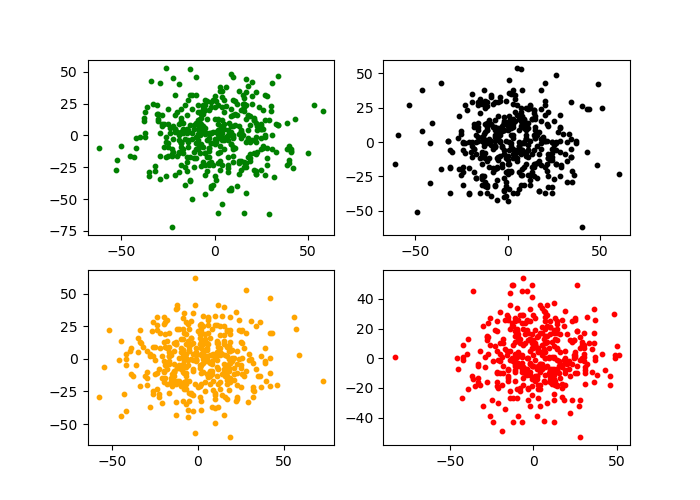
Here is an example. We are using for loop to iterate 4 times and create 4 subplots inside a matplotlib figure in a 2×2 plot grid.
x and y are updated in each iteration using numpy’s standard normal distribution function to create random normal distribution data around 0.
A custom color list is also used in iteration to give different colors to scatter points for visual beauty.
Pyplot’s scatter function is used at each iteration to create a scatter chart to the pointed subplot index via pyplot.subplot.
color=['red', 'blue', 'lightgreen', 'orange', 'green', 'black']

n=20
for i in range(0,4):
    x = np.ceil(np.random.standard_normal((n,n))*n)
    y = np.ceil(np.random.standard_normal((n,n))*n)
    col = color[random.randint(0,5)]
    plt.subplot(2,2,i+1)
    plt.scatter(x,y, s=10, color=col)
You could take this example and use it to create 10s of different multi-plot grids including bar multiplots, line multiplots, pie multiplots, scatter multiplots, histogram multiplots, contour and contour fill multiplots, box multiplots, map multiplots and even multiplot animations.
If you need you can revisit Python For Loops here.
Just a plain vanilla example with dummy charts. You can always add titles or make adjustments to chart components such as axes and ticks.
4- Refined Multiplot Example
In this Python Animation Tutorial we have explored animated bar charts.
We learned the main components of Python animations, how to create bar chart animations and how to save them.
We also demonstrated this knowledge through multiple examples such as,
Colormap Example
You can see this tutorial about creating multi-plot grids.
import matplotlib.pyplot as plt
import random
import numpy as np
from matplotlib import cm
from matplotlib.colors import ListedColormap, LinearSegmentedColormap
import seaborn as sns
%matplotlib qt
plt.style.use("seaborn-whitegrid")
plt.figure(figsize=(15,15))
color=['red', 'blue', 'lightgreen', 'orange', 'green', 'black']
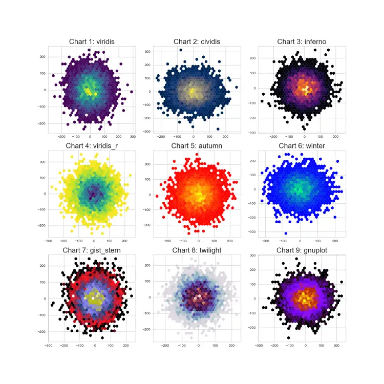
cmap = ["viridis", "cividis", "inferno", "viridis_r", "autumn", "winter",
"gist_stern", "twilight", "gnuplot", "binary", "copper"]
n = 70
for i in range(0,9):
plt.subplot(3,3,i+1)
col = color[random.randint(0,5)]
x = np.ceil(np.random.standard_normal((n,n))*n)
y = np.ceil(np.random.standard_normal((n,n))*n)
plt.hexbin(x.flatten(),y.flatten(),gridsize=30, mincnt=1, edgecolors="none", cmap=cmap[i])
plt.title("Chart {}: {}".format(i+1, cmap[i]), size=20)Summary
In this Python Visualization Tutorial we learned how to create multi-plot grids also referred to as multiple charts.
We learned the subplot method which can be used to create grids of any dimension and can be iterated through its grids via index parameter.
We have also created a few multiple chart examples to show the construction in action and share some ideas of how multi-plot grids can be used in creative ways to enhance science papers, blog articles, consulting projects and even newspapers and social media.
We also demonstrated this knowledge through multiple examples such as,