
Plotly library offers amazing opportunities for
- data visualization;
- static charts,
- scatter plot,
- line graph
- bar chart
- geodata charts
- geographic plots
- pie charts
- bubble charts
- map charts
- network graphs
- area charts
- spider charts
- doughnut charts
- etc. (some of these terms overlap or can be synonyms)
- animated charts & graphs
- interactive charts
- data animation
- geovisualization etc.
Where it truly shines is the possibilities it offers when it comes to embedding those beautiful visuals on websites and applications.
Used Where?
- Exploring data
- Presentations
- Business Strategy
- Scientific Research
- Financial markets
- Applications
- Websites
Estimated Time
15 mins
Skill Level
Upper-Intermediate
Exercises
na
Content Sections
Course Provider
Provided by HolyPython.com
Preparation Steps for Data Visualization (Data and Libraries)
It might make sense to break up the task and process it in chunks like this:
- Import necessary libraries
- Get and Read data
- Create the plotly figure
Let’s take care of the 1st step already and import the needed Python libraries:
Python Libraries that will be used (Pandas & Plotly & Plotly Express)
import pandas as pd
import plotly.express as px
import plotly
Let’s take a look at the heart of the task.
fig = px.scatter(df, x="total_cases", y="total_deaths", animation_frame="date",
    animation_group="location", range_x=[100,10000000], range_y=[25,140000])
We will use plotly.express (shortened as px) to create a scatter animation.
If you look at the parameters passed to px.scatter , we will mainly need values for these arguments:
- x= (values for x axis)
- y= (values for y axis)
- animation_frame= (values for each animation frame)
- animation_group= (values for grouping data – if available)
- range_x= (range of x axis)
- range_y= (range of y axis)
df is the dataframe where data is contained.
fig = px.scatter(df, x="total_cases", y="total_deaths", animation_frame="date",
    animation_group="location", range_x=[100,10000000], range_y=[25,140000])
Passing values to plotly is so straighforward and intuitive. You just need to read a dataframe (it could be read from many sources such as excel files; .xls, .xlsx, .csv, .txt, database etc.)
Once dataframe is constructed all that’s left to be done is to pass the column names as values to the parameters mentioned above.
Now, let’s get a decent dataframe ready. We will come back to this later.
Data Source Ideas (Many different fields and sources)
As data science grows and matures, today, we have incredible sources for proper and clean data as well as raw data. You should never have a tough time finding data to explore unless you’re working on a niche or new field / subject.
- U.S. Data and Statistics | USAGov
- U.S. Census Data
- Worldbank Open Data
- Worldbank Trade Data
- World Trade Organization
- U.K. Police Data
- WHO Health and Mortality Data
- IMF Data
- OECD Data
- Europe Data
- Nasdaq Historical Financial Data (Nvidia Example)
- Nasdaq Option Price Data (Amazon Example, might require some data parsing)
- Google Finance Data (Can be imported to excel with this code)
- European Environment Agency
- EPA (U.S. Environmental Protection Agency) Data
- OurWorldInData
- Kaggle Free Datasets (43.750 Datasets Available)
- Space Data by Nasa
- Federal Aviation Data
- Global Wind Atlas – Wind Data
- ICE Energy Futures & Options Data
- California Renewable Energy Data
- Scandinavia Electricity Market Data
On top of that you can explore a few datasets already included in plotly for your experimenting convenience. But you should definitely taste the joy of finding your own data and constructing your own Plotly Animations. Here is how you can check out already included Plotly Datasets:
import plotly.express as px
print(help(px.data))
—SUMMARIZED OUTPUT—
Name : plotly.express.data – Built-in datasets for demonstration, educational and test purposes.
Functions:
carshare() – Each row represents the availability of car-sharing services near the centroid of a zone in Montreal over a month-long period.
election() – Each row represents voting results for an electoral district in the 2013 Montreal mayoral election.
election_geojson() – Each feature represents an electoral district in the 2013 Montreal mayoral election.
gapminder() – Each row represents a country on a given year.
iris() – Each row represents a flower.
tips() – Each row represents a restaurant bill.
wind() – Each row represents a level of wind intensity in a cardinal direction, and its frequency.
You can use any of the built-in dataset by assigning them to a dataframe variable as:
df = px.data.carshare()
df = px.data.election()
df = px.data.election()
df = px.data.election_geojson()
df = px.data.gapminder()
df = px.data.iris()
df = px.data.tips()
df = px.data.wind()
In this tutorial we will work on external data regarding Covid19 (or Coronavirus).
Reading Data into Pandas and Plotly
Now we need to get some data ready. I think Covid numbers are interesting.
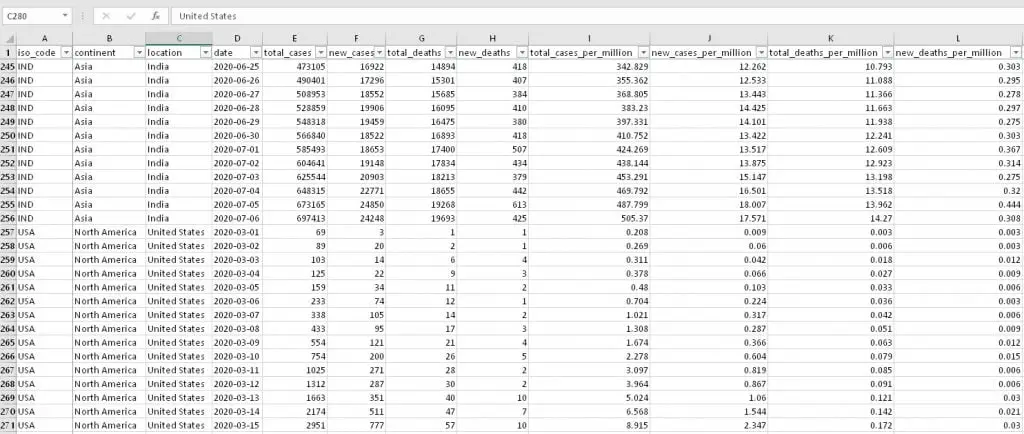
Here is a Excel sneak peak of the data that I have.
I have slightly cleaned it so that:
- Only countries with population above 1M is included.
- Blank cells are excluded
- Date starts from March 1
pandas.read_excel is perfectly appropriate to read data from this excel file. Here are some of the other ways to read data with pandas library of Python should you like to work with different file formats than Excel. You can even read data from clipboard, so cool.
f = 'Desktop/covid-data7.xlsx'
file = open(f, "r")
df = pd.read_excel(f, index_col=0)
Various Pandas methods to read data from different sources:
pandas.read_pickle
pandas.read_table
pandas.read_csv
pandas.read_fwf
pandas.read_clipboard
pandas.read_excel
pandas.read_json
pandas.read_html
pandas.read_hdf
pandas.read_feather
pandas.read_parquet
pandas.read_orc
pandas.read_sas
pandas.read_spss
pandas.read_sql_table
pandas.read_sql_query
pandas.read_sql
pandas.read_gbq
pandas.read_stata
Now that we the data part figured out, we can start the visualization part. But first, let’s explore it a little bit with Python without having to open Microsoft Excel.
.head() and .columns can be useful here.
print(df.head())continent location ... hospital_beds_per_thousand life_expectancy
iso_code ...
CHN Asia China ... 4.34 76.91
CHN Asia China ... 4.34 76.91
CHN Asia China ... 4.34 76.91
CHN Asia China ... 4.34 76.91
CHN Asia China ... 4.34 76.91
CHN Asia China ... 4.34 76.91
CHN Asia China ... 4.34 76.91
CHN Asia China ... 4.34 76.91
CHN Asia China ... 4.34 76.91
CHN Asia China ... 4.34 76.91
print(df.head().columns)Index(['continent', 'location', 'date', 'total_cases', 'new_cases',
'total_deaths', 'new_deaths', 'total_cases_per_million',
'new_cases_per_million', 'total_deaths_per_million',
'new_deaths_per_million', 'total_tests', 'new_tests',
'total_tests_per_thousand', 'new_tests_per_thousand',
'new_tests_smoothed', 'new_tests_smoothed_per_thousand', 'tests_units',
'stringency_index', 'population', 'population_density', 'median_age',
'aged_65_older', 'aged_70_older', 'gdp_per_capita', 'extreme_poverty',
'cvd_death_rate', 'diabetes_prevalence', 'female_smokers',
'male_smokers', 'handwashing_facilities', 'hospital_beds_per_thousand',
'life_expectancy'],
dtype='object')
for i in (df.head().columns):
    print(i, end=' || ')
continent || location || date || total_cases || new_cases || total_deaths || new_deaths || total_cases_per_million || new_cases_per_million || total_deaths_per_million || new_deaths_per_million || total_tests || new_tests || total_tests_per_thousand || new_tests_per_thousand || new_tests_smoothed || new_tests_smoothed_per_thousand || tests_units || stringency_index || population || population_density || median_age || aged_65_older || aged_70_older || gdp_per_capita || extreme_poverty || cvd_death_rate || diabetes_prevalence || female_smokers || male_smokers || handwashing_facilities || hospital_beds_per_thousand || life_expectancy ||
Now, we’re actually ready to create our Plotly Animation. Let’s try a scatter using plotly’s px module.
fig = px.scatter(df, x="total_cases", y="total_deaths", animation_frame="date",
    animation_group="location", range_x=[100,10000000], range_y=[25,140000])
Opening Plotly Animation
If you managed to come so far without errors, congratulations now you have an awesome Plotly animation at hand.
You might be excited to open it and see what you’ve created so let’s get to that.
Plotly offers cloud solutions for Data Visualization. That’s why you will hear or read about offline and online methods to open its visualizations.
Online method refers to using its convenient cloud service: Chart Studio while offline method refers to having a local output and opening that file.
Offline Saving Method (write_html)
Opening a plotly animation is as simple as saving it on your Desktop with a piece of code as below:
fig.write_html("Desktop/file.html")Please note that you might need to change the file path and name. Also you might in some cases have to type the full path and use raw string format such as:
r'c://Users/ABC/Desktop/mygraph.html'Raw string works like a charm when you encounter path conflicts in Python sometimes.
Your visualization can be opened as an html file in any browser.
Below you can see the Plotly Animation based on Covid data, play the animation and interact with it in different ways:
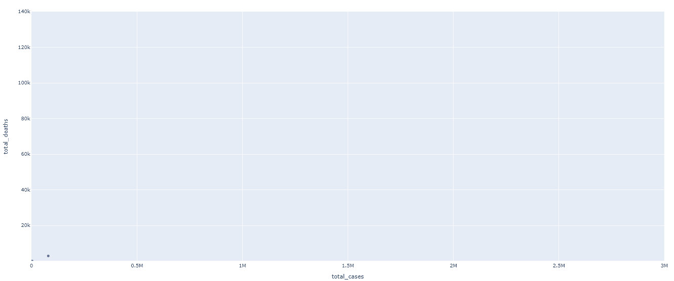
This animated chart is just a super simple data representation but it’s missing lots of optional parameters such as size, color and grouping. Also you can see that both x and y axes are not logarithmic. This causes lots of datapoints to be clustered while only one or two extreme points take off.
Below you can find different parameters to improve our chart:
Step up your story-telling (Size, color, grouping, hover-names and log scale)
Now, the visualization as it is right now isn’t very pleasant to the eye and it also doesn’t say that much right away. Let’s fix that.
There are very useful parameters that can be implemented to make the chart have bigger appeal. You can just add following parameters to your figure as below:
size=”population” (bubble sizes will be based on country population size)
color=”continent” (bubbles in chart will be grouped based on their continent)
hover_name=”location” (when someone hovers over the bubbles they’ll see location information)
log_x=True (will convert x axis to logarithmic scale if True)
log_y=False (will convert y axis to logarithmic scale if True)
size_max=45 (bubble size will be capped at 45)
fig = px.scatter(df, x="total_cases", y="total_deaths", animation_frame="date", animation_group="location",
            size="population", color="continent", hover_name="location",
            log_x=True, log_y=True, size_max=45, range_x=[100,10000000], range_y=[25,140000])
Now it should look much better. And, these parameters have more contribution than just the looks:
- You can interact with each bubble by hovering on your mouse on them and see more information
- You can also click on the continent index to include or exclude a particular continent.
- You can also choose to do the grouping based on something else such as (size or continent) and interact with the index that way.
Online Saving Method (Plotly Chart Studio, Github and others)
You can read further regarding:
- Plotly chart or animation saving methods
- online saving methods
- more offline saving methods
- image
- gif
- json
- html
- How to embed Plotly charts and animations with interactivity in a website page
Part II: How to save Plotly charts and animations.
You can also check out Plotly’s Official Github Repository here.