Hexbin function (of Pyplot) can be used to create Hexagonal Bins. This specific charting techniques is useful for visualizing distributions, distances, clusters and density functions.
Hexbin Plot are used in a huge range of domains such as Machine Learning, Topography, Geography, City Management, Transportation, Science and Data Science.
We will see “how to create an save hexbin plots” as well as a couple of cool hexbin plotting examples in this Python tutorial.
1- Hexbin Charts
Hexbin charts consist of points that look like hexagon shapes. Hexbin works well with binned datasets.
Hexbin is a great alternative to Hist2d plots. And although they are different types of charts hexbin can be an alternative to scatter plots as well when suitable.
from matplotlib import animation
import matplotlib.pyplot as plt
from matplotlib.animation import FuncAnimation
import seaborn as sns
%matplotlib qt
With this knowledge shared above, you can unlock a whole new world of multiplot grids and even multiplot animations of all types, colors and shapes.
All you need is some loop knowledge to iterate through the index of the pyplot subplots.
2- Basic Hexbin Example 1
You can create hexbin charts using pyplot.hexbin function like below:
import numpy as np
import matplotlib.pyplot as plt
x = np.random.normal(size=(1, 10000))
y = np.random.normal(size=(1, 10000))
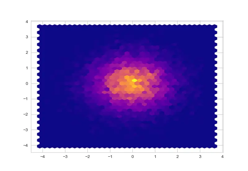
plt.hexbin(x, y, gridsize=35, cmap="plasma")
Simple hexbin chart created with plasma colormap
HexBin Charts can be customized via its parameters shared below. Making the hexagons bigger or smaller, deciding the minimum amount of samples for a hexagon to be visualized as well as applying a Python colormap or defining edgecolors can greatly change the appearance of hexbin charts and make them more suitable for your work.
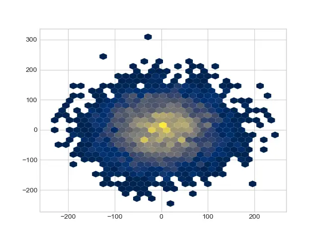
What is Hexagon Bin Chart?
Hexagon is a histogram like chart where each hexagon represents the density of samples (instead of bars in histogram).
It can be an alternative to histogram visualization but thanks to its elaborate use of x and y axes it can also be used as an alternative to scatter plots if data is suitable.
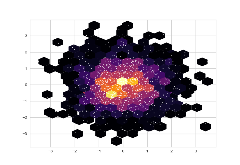
In the hexbin chart above with the points of the scatter plot overlaid you can see how outer hexagons correspond to less sample density (1 or 2 points) while as we go through inner hexagons point density is much higher. This image captures the idea of hexbin charts very as well as their inner workings well.
You can create similar charts just by using hexbin and scatter consecutively.
Hexbin has a couple of very useful parameters that allows more control on the hexbin plot.
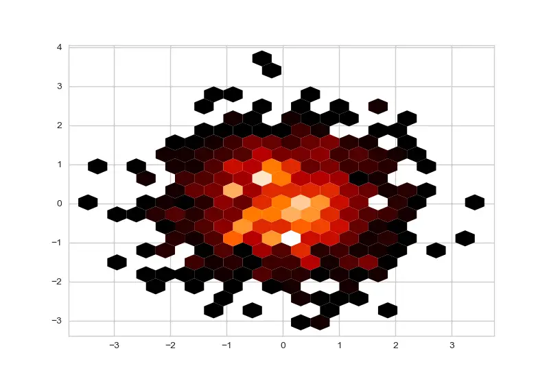
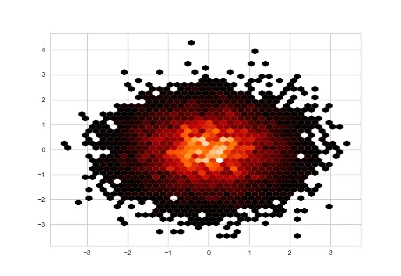
mincnt: Stands for minimum count, this is the parameter that defines the amount of samples needed for each point to be visualized with a hexagon. If you don’t assign a value it’s 0 (or None) by default and every point will be visualized.
Hexbin w/ mincnt=1
Hexbin w/ mincnt=0
Gridsize, Edgecolors and Cmap Parameters
Gridsize is a very useful parameter that lets you adjust the size of hexagons in the hexbin chart. Gridsize is negatively correlated with the hexagon size since it concerns the whole grid. I.e.: A hexbin chart with gridsize 50 will have much smaller hexagons than a hexbin chart with gridsize of 10. If gridsize is 10 this mean graph can be covered with 10 hexagons from one side to the other.
Edgecolors can be used to define the edge colors of hexagons in that chart.
cmap is a very useful parameter that can be used to apply Python colormaps to the whole distribution. This allows a very beautiful visual and high control over the color scheme of the chart in a very efficient and low effort way.
Check out the example below to see these hexbin parameters in action:
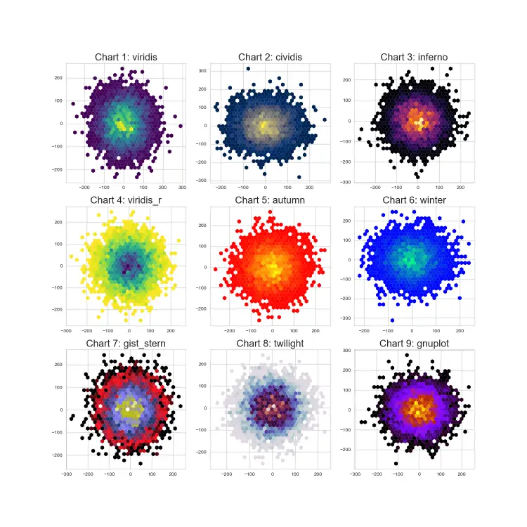
Hexbin Multi-Plot created with several popular colormaps
import matplotlib.pyplot as plt
import numpy as np
import seaborn as sns
plt.style.use("seaborn-whitegrid")
%matplotlib qt

plt.figure(figsize=(15,15))

cmap = ["viridis", "cividis", "inferno", "viridis_r", "autumn", "winter",
        "gist_stern", "twilight", "gnuplot", "binary", "copper"]

n = 70
for i in range(0,9):
    plt.subplot(3,3,i+1)

    x = np.ceil(np.random.standard_normal((n,n))*n)
    y = np.ceil(np.random.standard_normal((n,n))*n)
    plt.hexbin(x.flatten(),y.flatten(),gridsize=30, mincnt=1, edgecolors="none", cmap=cmap[i])
    plt.title("Chart {}: {}".format(i+1, cmap[i]), size=20)
Correct and proficient use of colors and colormaps can be a crucial component of creating beautiful charts and data visualization in general. To see a thorough tutorial on that:
You can conveniently save hexbin charts using savefig.() method. Just put the file name and path inside the savefig method including the file type extension such as png or jpg and your chart will be saved accordingly.
plt.savefig("Desktop/filename.png")
If you are using qt to view charts, you can also just use the qt GUI and click the save button on the top right. You can activate qt using the following Python magic command:
%matplotlib qt
Summary
In this Python Visualization Tutorial we learned how to create and save Python hexbin charts using pyplot’s hexbin function.
We learned the main hexbin parameters that can be significant on the visualization output if used effectively such as mincnt, gridsize, edgecolors and cmap.
We also demonstrated this knowledge through a few examples.