- How to create Plotly animations
- How to save Plotly animations
- How to create Mapcharts – Plotly & Mapbox
- How to create Matplotlib animations
- How to save Matplotlib animations
- Titles, Axes, Ticks & Legend
- Matplotlib Built-in Styles
- Animated Line Charts
- Multi-line Animation
- Stacked Area Charts
- Word Cloud Visualization
- Bar Chart Animations
- Colors with Python
- Creating Multiple Charts
- Creating Hexbin Charts
- Creating Pcolor Charts
Python Chart Elements: Title, Axes, Ticks, Legend
Contents
- Introduction
- Chart Title
- Title Color
- Title Size
- Title Position
- Title Vertical Margin
- Axis Size and Fixed Axes
- plt.xlim() & plt.ylim()
- Axis Label
- Xlabel
- Ylabel
- Axis Label Rotation
- Axes Ticks
- xticks() & yticks()
- Frequency
- No Ticks
- Tick Rotation
- Tick Color
- Chart Legend
- Chart Title
- Summary
Introduction
Every chart
If you have used Github, pcolor plots can look very similar to the progress grid there. In this tutorial we will demonstrate how to create and save pcolor charts.
Below you can see a pcolor chart without any additional elements or chart adjustments.
import matplotlib.pyplot as plt
import random

Z = np.random.rand(10, 30)
fig = plt.figure(figsize=(5,2))
plt.pcolor(Z, cmap="winter", edgecolors='k', linewidths=3, )
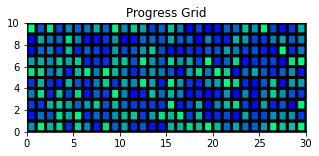
We will use this pcolor plot as a base and build its elements using Python and its famous Pyplot library (Matplotlib) below.
Pcolor is a visually striking visualization technique which you can use to visualize two dimensional datasets.
You can see this tutorial for more detail about it:
Or for a variety of other Plotting Techniques you can visit:
1- Chart Title
Chart title is one of the most crucial elements in communicating what your chart is about at first glance. The interpretation and observation usually starts after reading the title.
It’s very easy to create a chart title in Python using matplotlib’s pyplot module. Here is a sample code:

plt.title("Progess Grid")
a) Title Color
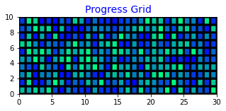
You can also adjust the color of the chart title:
plt.title("Progess Grid", color="blue")
b) Title Size
Additionally if the chart is large your title with default size might appear too small and vice versa. So it can be necessary to adjust the title size as well:
plt.title("Progess Grid", color="blue", size=14)
c) Title Position
Using loc parameter, you can adjust the position of a title on the chart. loc parameter takes values like left, center and right.
loc parameter can also be applied to other chart elements like axes labels.
plt.title("Progess Grid", color="blue", size=14, loc="left")
d) Title Vertical Margin
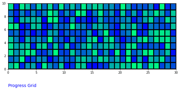
Additionally, y parameter can be used to adjust title position vertically. By default y is 1 and title will appear right above the chart. A value like 1.1 will create more margin above the Python chart while a negative value can be used to move chart title below the chart.
Here is an example:
plt.title("Progess Grid", color="blue", size=14, y=-0.3, loc="left")
2- Axis Size and Fixed Axes
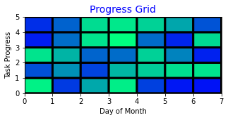
Axis size is an automatically adjusted property for Matplotlib charts but you can also assign them specific sizes and make them fixed in which case axis of a chart won’t change according to data.
This can be especially useful when creating Python animations for example:
But also you might want the data to appear smaller on the chart or you might want to zoom in on a specific section of the dataset in which cases increasing or decreasing the axis sizes can also come handy.
a) plt.xlim() & plt.ylim()
You can simply assign lower and upper limits to plot axes using Python code below:
plt.xlim(0,7)
plt.ylim(0,5)
3- Axis Label
Axes labels can also be crucial (even more crucial than the chart title sometimes) for a chart to be meaningful and professional.
We have too useful pyplot functions which can be used to define axes labels.
a) xlabel()
It’s quite simple to create axis labels using matplotlib and Python. All you have to do is run xlabel() function to add an x-axis label to your chart. Here is an example:
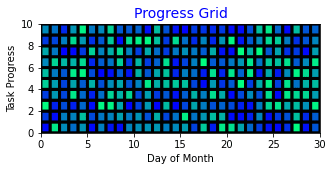
plt.xlabel("Day of Month")
b) ylabel()
You can assign a y-axis label to your chart using ylabel() function.
plt.ylabel("Task Progress")
c) Axis Label Rotation
With y-axis it might often be necessary to also adjust the rotation of the axis label. This can easily be achieved using rotation parameter and assigning a rotation angle to it.
plt.ylabel("Task Progress", rotation=90)
c) Label Margin
With y-axis it might often be necessary to also adjust the rotation of the axis label. This can easily be achieved using rotation parameter and assigning a rotation angle to it.
plt.ylabel("Task Progress", rotation=90)
4- Axes Ticks
Ticks are another fundamental component in a Python chart. You can adjust the names, frequencies, colors and even rotation of axis ticks to suit them better.
a) xticks() & yticks()
Axes Ticks can be adjusted using xticks() and yticks() methods in Python. Additionally, we have to pass the range of tick values for the first parameter and numpy’s arange function is usually very convenient for this task.
Look at this Python code example:
plt.xticks(np.arange(5), ['Day 1', 'Day 2', "Day 3", "Day 4", "Day 5"], rotation=75)
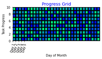
To understand what’s exactly happening here we need to first understand np.arange() function. This Python code will return an array object as following:
np.arange(5)
[0 1 2 3 4]
b) Tick Frequency Adjustments
Numpy’s arange function functions very similar to the range function which can also be used in the same place for tick values alternatively. You can see the link for a detailed lesson about range functions.
So, to cover a span of 30 days in this case we will need to use something like this:
np.arange(0, 30, 1)
[ 0 1 2 3 4 5 6 7 8 9 10 11 12 13 14 15 16 17 18 19 20 21 22 23
24 25 26 27 28 29]
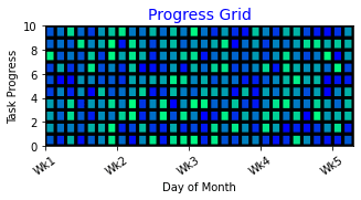
But to avoid creating 30 label values, let’s create x-axis ticks for weekly values and name them accordingly.
plt.xticks(np.arange(0, 30, 7), ['Wk1', 'Wk2', "Wk3", "Wk4", "Wk5"], rotation=75)
We needed 5 label values because that’s the amount of ticks we get by using:
np.arange(0, 30, 7)
[0 1 2 3 4]
And the resulting Python chart:
c) No Ticks
No ticks can also be a necessity with some charts. By default matplotlib will add convenient ticks to every chart but you can easily eliminate them.
One of the most practical way to remove ticks from axes is to call an empty list with xticks() function like below:
plt.xticks([])
plt.yticks([])
And the ticks will disappear:
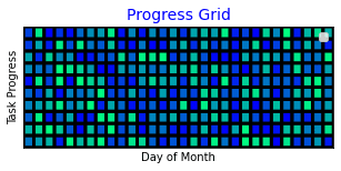
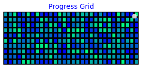
If you realize we still have the axes labels (or axes titles) on our Python chart. There is another method that will completely cancel all axis objects including ticks and axes labels. That is plt.axis(“off”)
You can use it like Python code below:
plt.axis("off")
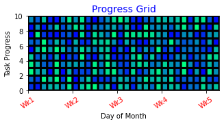
d) Tick Color
plt.xticks(np.arange(0, 30, 7), ['Wk1', 'Wk2', "Wk3", "Wk4", "Wk5"], rotation=35, color="red")
5- Chart Legend
Legend is another chart element that can enhance a visualization. To activate legend simply execute Python code below.
Legend function will require labels to have been passed when creating the plot. Otherwise you will receive an error.
plt.legend()No handles with labels found to put in legend.
Summary
In this Python Visualization Tutorial we learned how to make crucial chart and plot adjustments so that our data visualizations appear more professional and also they communicate more meaningful messages.
We learned convenient settings about chart titles, axes labels, axes ticks and legend. We learned how to make them smaller or larger, give them color and adjust their rotation.
Additionally, you can also use built-in Matplotlib Styles to add grids to the background of your Python chart or change the overall color theme.
Visualization is a huge part of any business regardless domain and you can reap the benefits of having exceptional visualization skills by spending a little bit of extra time creating charts.
If you’d like to gain some great Data Visualization skills with Python you are welcome to visit our related tutorials below:
