
<<< Visualization Tutorials
—————————
- How to create Plotly animations
- How to save Plotly animations
- How to create Mapcharts – Plotly & Mapbox
- How to create Matplotlib animations
- How to save Matplotlib animations
- Titles, Axes, Ticks & Legend
- Matplotlib Built-in Styles
- Animated Line Charts
- Multi-line Animation
- Stacked Area Charts
- Word Cloud Visualization
- Bar Chart Animations
- Colors with Python
- Creating Multiple Charts
- Creating Hexbin Charts
- Creating Pcolor Charts
Creating Bar Chart Animations
Introduction
Previously, we have learned how to create Python Line Animations (or Animated Line Charts) using Matplotlib with a couple of tutorials.
In this tutorial we will start with the simplest animated bar chart example and build up from there with more advanced animated bar chart examples demonstrating some of the possibilities that can be achieved with this skill.
Although Bar Chart Animations can be generated with the same libraries and principles there are also a few differences that can be confusing.
So, we have created this Bar Chart Animation tutorial which shows how to create “Bar Chart Animations” using Python and Matplotlib.
Note: Information about saving bar animations as gifs or video files (mp4, avi) at the bottom.
Introduction
1- Matplotlib's FuncAnimation and pyplot.bar
stackplot() is the function that can be used to create stacked area charts. It’s usage is pretty straightforward. We need data sequences for x-axis and values that share the y-axis concurrently. It will be something like below:
stackplot(x, y1, y2, y3…)
Let’s gear up the Python libraries we may want to use for this task.
2- Example 1: Most Simple Python Bar Animation
Libraries: Matplotlib, Seaborn, Funcanimation
As usual, let’s first get the libraries we need and use some Python magic (%matplotlib qt) to arrange the window which will show the Python Bar Animation.
from matplotlib import animation
import matplotlib.pyplot as plt
from matplotlib.animation import FuncAnimation
import seaborn as sns
%matplotlib qt
Chart Figure, Axes and Data for Bars:
After importing the libraries we need to:
- Create a figure for the chart area.
- Create axes object
- Fix y-axis of the axes object
- We can also style our animation a little bit with pyplot.style.use.
Nothing too complex. We also need data for bars. Important point with data is that all the sequences for each bar need to have the same size. This is because animation needs to have a corresponding value for each object.
Check out the manually formed Python lists below:
%matplotlib qt
fig = plt.figure(figsize=(8,6))
axes = fig.add_subplot(1,1,1)
axes.set_ylim(0, 150)
plt.style.use("seaborn")

lst1=[1, 2, 3, 4, 5, 6, 7, 8, 9, 10, 11, 12, 13, 14, 15 ]
lst2=[0, 5, 10, 15, 20, 25, 30, 35, 40, 50, 60, 70, 80, 90, 100]
print(len(lst1), len(lst2))
15 15
Animation Function (for Bar Chart):
Let’s use seaborn to create a color palette from seismic builtin color palette. We will split seismic color palette in 2 via seaborn.color_palette since we only have 2 bars in the animated bar chart.
We will also need empty containers so we can fill them at each iteration of the animation function. Below you can see the animation function and the color creation steps:
palette = list(reversed(sns.color_palette("seismic", 2).as_hex()))

y1, y2, = [], []
def animate(i):
    y1=lst1[i]
    y2=lst2[i]

    plt.bar(["one", "two"], [y1,y2], color=palette)
Inside the animation function for bar animation we are using plt.bar to create bar charts at each iteration.
If you noticed, pyplot.bar takes the x-axis values first and then y-axis values of each bar as a collection. X-axis values are simple and consist of the names of the bars. Y-axis values are values of each bar (y1, y2) inside a data structure like Python lists or tuples.
Note: For Horizontal Bar Charts, you can use pyplot.barh and that’s also one of our animated bar chart examples below.
Title and Animation Object (FuncAnimation):
Finally let’s add a title to the chart using plt.title and also let’s create the animation object using FuncAnimation function.
You can change the color of the title using color parameter also as below:
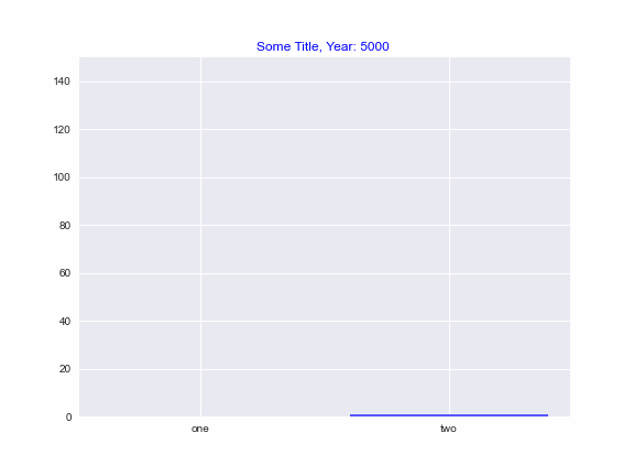
plt.title("Some Title, Year: {} ".format(5000), color=("blue"))
ani = FuncAnimation(fig, animate, interval=100)
If you have included %matplotlib qt magic successfully somewhere in your code, animation will show in external window as below:
Great! Now you know how to create Python Bar Chart Animations. The rest is up to your experience, domain and creativity.
We also created a few other examples that might be helpful to advance your animated bar chart skill below.
Possible error points for bar chart animations:
- Bar value size mismatch: Data for each bar is not the same size. y1 and y2 needs to be the same size as a collection even if one of the bars finalize animating more quickly (more clear in 2nd example), this will only cause errors in some cases.
- Bar values passed individually: plt.bar()’s y-axis values are not passed inside a collection, see below.
Bars will overlap and won’t show properly. - X-axis size mismatch with bar amount: item length of x-axis values not matching amount of bars.
ValueError: shape mismatch: objects cannot be broadcast to a single shape - Bar animation not showing: %matplotlib magic not used correctly and animation not showing
plt.bar(["one", "two"], y1, y2, color=palette)
3- Example 2: Python Bar Animation
Now, let’s create a slightly more complex data and animated bar chart based on that.
In this example, differently:
- we will create larger datasets using Python list comprehension,
- we will sort bar values so that bars end up in order using sorted function,
- we will assign tick values using (plt.xticks)
- we will play with colors a little and reverse a color palette.
Data:
fig = plt.figure(figsize=(7,5))
axes = fig.add_subplot(1,1,1)
axes.set_ylim(0, 310)
plt.style.use("seaborn")

x, y1, y2, y3, y4 = [], [], [], [], []


lst1=[i if i<175 else 175 for i in range(300)]
lst2=[i if i<255 else 255 for i in range(300)]
lst3=[i if i<30 else 30 for i in range(300)]
lst4=[i if i<65 else 65 for i in range(300)]
Reversing the builtin color palettes
So, seaborn’s afmhot is a very nice and dramatic color palette but it starts with dark red and ends with yellow. I’d like to have the opposite in this animation and start with yellow and end with red.
For this we will use reversed function on the list we derive from seaborn’s afmhot palette. It’s easy. See below.
Tick values
Additionally it can be nice to have a better control on the x-axis tick values. This can be achieved using plt.xticks inside the animation function as below.
palette = list(reversed(sns.color_palette("afmhot", 4).as_hex()))

def animate(i):
    y1=lst1[i]
    y2=lst2[i]
    y3=lst3[i]
    y4=lst4[i]

    plt.bar(range(4), sorted([y1,y2, y3, y4]), color=palette)
    tick_lst=["one", "two", "three", "fourfive"]
    plt.xticks(np.arange(4), tick_lst)
Animation Object via FuncAnimation
We have data, a figure (fig) and function animation that creates bar charts for every frame at every iteration (animate). So, we can create an animation object and see the results of our more elaborate animated bar chart with reversed color palette and custom xtick values.
plt.title("Some Title, Year: {} ".format(5000), color=("blue"))
ani = FuncAnimation(fig, animate, interval=10)
Animated Bar Plot Results:
Looks good and advanced. This is the kind of animation that you can put in an Ernst & Young presentation for example and it still won’t look amateur at all.
Let’s continue raising the bar. I’m sure you’ve seen those horizontal bar animations where values continue updating as the years pass and animation dynamically sorts the bars as they can.
One such animation was very popular demonstrating Tesla Model 3 sales taking over other brands as the months passed. I’m sure there has been many derivatives of these animations. Let’s create it completely using Python and its libraries.
4- Example 3: Advanced Python Bar Animation
In this round, we will create a slightly more complex data and an animated horizontal bar chart based on that data.
In this example, differently we will:
- Create a horizontal bar chart animation using Python
- Update ticks dynamically as bar order changes in the animation
- Update title dynamically for each frame based on corresponding year
Data:
Below we are reading a csv file using pandas read_csv function and creating sub-dataframes using dataframe filtering techniques based on column names. Finally, we are also using .values attribute to only get values of a single column rather than a dataframe with index.
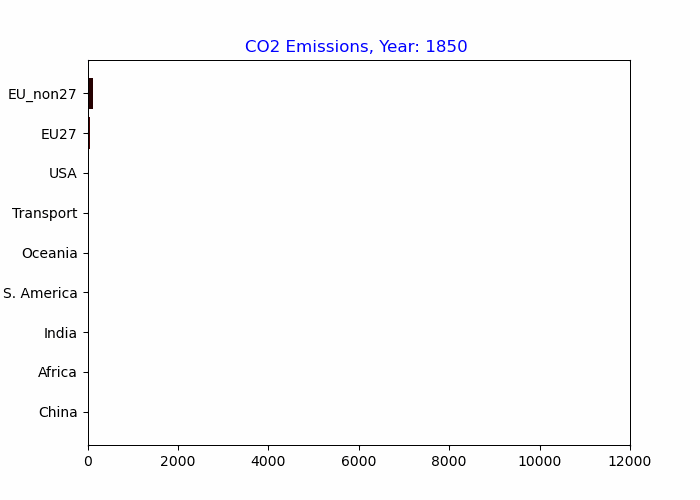
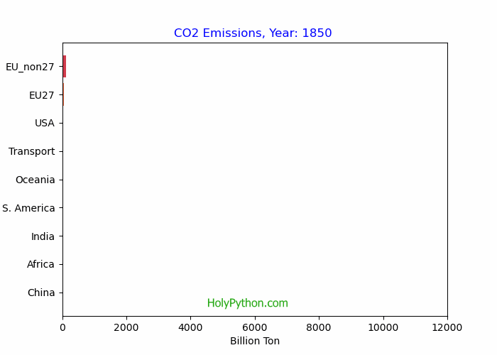
This data represents the historical CO2 Emission values of some big countries and regional clusters. It’s incomplete yet still interesting nevertheless and CO2 emissions are very hot topic as well as crucial for our future.
df = pd.read_csv("Desktop/annual-co2.csv")
year = np.unique(df['Year'].values)

chi = (df[df['Entity']=="China"]['Annual CO2 emissions']).values
usa = (df[df['Entity']=="United States"]['Annual CO2 emissions']).values
eu27 = (df[df['Entity']=="EU-27"]['Annual CO2 emissions']).values
afr = (df[df['Entity']=="Africa"]['Annual CO2 emissions']).values
ind = (df[df['Entity']=="India"]['Annual CO2 emissions']).values
sa = (df[df['Entity']=="South America"]['Annual CO2 emissions']).values
eunon27 = (df[df['Entity']=="Europe (excl. EU-27)"]['Annual CO2 emissions']).values
oce = (df[df['Entity']=="Oceania"]['Annual CO2 emissions']).values
transport = (df[df['Entity']=="International transport"]['Annual CO2 emissions']).values
Reversing Spectral Color Palette:
We can use Spectral color palette with a little bit of help from seaborn’s color_palette function. Proper country names can also be handy and more presentable.
palette = list(reversed(sns.color_palette("Spectral", 9).as_hex()))
labels = ("China", "USA", "EU27", "EUnon27", "India", "Africa", "transport", "SA", "Oceania")
Figure and Axes:
Figure and axes as usual but also, let’s add x-axis label so that chart’s x-axis values are more clearly interpretable. In this case CO2 emissions are represented in Billion Tons.
fig = plt.figure(figsize=(7,5))
axes = fig.add_subplot(1,1,1)
axes.set_xlim(0, 12000)
plt.style.use("seaborn")
axes.set_xlabel("Billion Ton")
Animation Function (func):
We can use pyplot.barh() to create horizontal bar charts for each animation frame.
So a few points here:
- We are using sorted function for bars and reversed color palette as in the previous example.
- We are using Python’s format method to format the chart title dynamically at each frame. We are starting that value from 1850 as that’s the first year in our version of the CO2 emission data.
The whole tick thing:
Tick management is slightly more complicated here since they need to be updated at each frame. One challenge is that ticks can’t be coming from a static list since bar orders change repetitively.
Solution is using sorted function and items method of dictionaries to map each label to a bar. So, when bars are sorted labels will follow and the rest is just using that sequence to create y-axis ticks using plt.yticks.
We are using plt.yticks instead of plt.xticks since bar chart is horizontal and values are on the x-axis while bar names are on the y-axis.
def animate(i):
    y1=((chi[i]))
    y2=((usa[i]))
    y3=((eu27[i]))
    y4=((afr[i]))
    y5=((ind[i]))
    y6=((eunon27[i]))
    y7=((sa[i]))
    y8=((oce[i]))
    y9=((transport[i]))

    plt.barh(range(9), sorted([y1,y2,y3,y4,y5,y6,y7,y8,y9]), color=palette)

    tickdic = {"China":y1, "USA":y2, "EU27":y3, "Africa":y4, "India":y5,
       "EU_non27":y6, "S. America":y7, "Oceania":y8, "Transport":y9}

    sorted_tickdic = sorted(cntdic.items(), key=lambda x: x[1])

    tcks = [i[0] for i in sorted_tickdic]

    plt.title("CO2 Emissions, Year: {} ".format(i+1850), color=("blue"))
    plt.yticks(np.arange(9), tcks)
Once data, figure and animation function are out of the way it’s the moment of truth with FuncAnimation. We can gather our objects and see how the results of our horizontal bar chart appear.
ani = FuncAnimation(fig, animate, interval=30)
The results are satisfactory to say the least. Color palette is representing the data very well, title and yticks are updating dynamically. Pace allows following the development of CO2 Emission evolution per country.
- This data isn’t normalized for population and lots of countries are missing so it can be misleading and unfair to derive ultimate conclusions from it. However we can still interpret a few things clearly:
- Historically USA and Europe emitted massive amounts of CO2
- China’s recent catch up and surpass was phenomenal however and it just adds to the overuse and environmental risks on our Blue Planet.
- India’s CO2 emissions are also growing rapidly.
- International Transport is an emission category that shouldn’t be underestimated as it ‘s competing with the CO2 output of the whole South America region and it surpasses Oceania including Australia and New Zealand.
- Cumulative global CO2 emissions are off the charts!
Horizontal Bar Chart Animation:
Our planet is amazing at recovering after enduring huge amounts of damage similar to human body and other phenomenon in nature. However, if we continue to suppress those fragile balances no one knows the true extent of negative consequences that may result from the snowballing effects. Scientific forecasts are overwhelmingly alarming and it’s clear we must act now and take steps towards a more friendly and sustainable existence on our so far only home.
Note: Co2 data used in this example can be found at: Our World In Data CO2 Emissions.
Saving Bar Animations as gif or video (mp4, avi)
You can create gif files as in this tutorial using Python code example below or refer to this article for a detailed Python animation saving tutorial.
*Higher frame per second (fps) values will result in faster animations.
f = r"Desktop/new_animation.gif"
writergif = animation.PillowWriter(fps=59)
ani.save(f, writer=writergif)
Saving Bar Charts and other animations in Python can sometimes be tricky so to avoid errors and conveniently be able to save Python Animations as gif or video files (such as mp4, avi and mov) you can refer to this tutorial:
Alright let’s continue learning Python Animations and specifically Animated Bar Charts!.
Summary
In this Python Animation Tutorial we have explored animated bar charts.
We learned the main components of Python animations, how to create bar chart animations and how to save them.
We also demonstrated this knowledge through multiple examples such as,