
<<< Visualization Tutorials
—————————
- How to create Plotly animations
- How to save Plotly animations
- How to create Mapcharts – Plotly & Mapbox
- How to create Matplotlib animations
- How to save Matplotlib animations
- Matplotlib Built-in Styles
- Animated Line Charts
- Multi-line Animation
- Stacked Area Charts
- Word Cloud Visualization
- Bar Chart Animations
- Colors with Python
- Creating Multiple Charts
- Creating Hexbin Charts
- Creating Pcolor Charts
Guide to Python Animations: Animating Multiple Lines

Holy Python is reader-supported. When you buy through links on our site, we may earn an affiliate commission.
Introduction
Previously we have seen how to create and save Python animations. We then elaborated those tutorials on how to create line animations specifically and in that tutorial we discussed some details like fixing axes and coloring lines etc.
In this tutorial let’s go one step further and create charts with multiple lines. This can be particularly useful with Python animations since we can demonstrate different paths an asset, company, scientific observation, weather phenomenons etc. can take.
1- Matplotlib Pyplot and FuncAnimation
We will use Matplotlib library mainly in this tutorial. From Matplotlib there are two important modules we will use primarily:
- pyplot: This module is the backbone of charts. Since animations are multiple charts generating each frame of an animation it is one of the main ingredients in this tutorial.
- animation: This is the module that contains FuncAnimation which is used to create animations in Python.
- FuncAnimation: This is the function that helps us create Python animations using figures and animation function.
Let’s start with importing everything we need. This won’t be a complicated example.
import random
import matplotlib
from matplotlib import animation
import matplotlib.pyplot as plt
from matplotlib.animation import FuncAnimation
%matplotlib qt
2- Example 1: Line animation with multiple lines
We will need data for 3 line objects. They can share the same x-axis values and move in sync horizontally but we will need 3 different set of y values for them.
Let’s create some data using List Comprehension and random library’s randint function.
l1 = [random.randint(-10,4)+(i**1.68)/(random.randint(13,14)) for i in range(0,160,2)]
l2 = [random.randint(0,4)+(i**1.5)/(random.randint(9,11)) for i in range(0,160,2)]
l3 = [random.randint(-10,10)-(i**1.3)/(random.randint(11,12)) for i in range(0,160,2)]
If you are familiar with exponentiality that’s what we are doing to obtain 3 lists for line 1, line 2 and line 3.
- 3rd line has a gentle negative exponential slope achieved by -i**1.3
- We are also dividing each value with a random integer with a value around 10. These actions are just to create slightly different exponential lines with their own characters to make data look as natural as possible. You can definitely play around with it.
- Oh, and the first part of list comprehensions, just some random root value again using randint introducing more randomness to the initial step.
from itertools import count
xval= count(0,3)
count method works with two useful parameters: start and step: count(start, step).
Above, we are starting to count from 0 and going with steps of 3. So x-axis will go like: 0, 3, 6, 9…
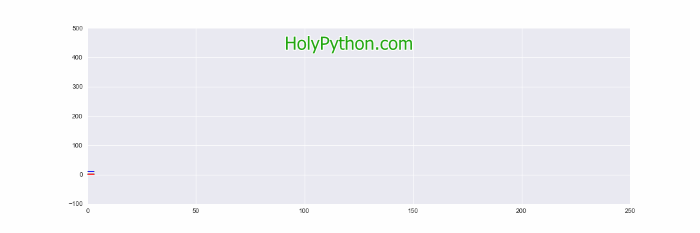
Let’s initiate the chart figure using pyplot and set the axes to fixed values. We can also use a different style like ggplot this time which is inspired by R Language’s famous ggplot package.
fig, axes = plt.subplots(nrows = 1, ncols = 1, figsize = (15,5))
axes.set_ylim(-100, 500)
axes.set_xlim(0, 250)
plt.style.use("ggplot")
Aside of creating sequences for three different lines, this next step is where most operational difference takes place. We will create 2 extra empty lists for our new lines (y2 and y3) totaling 4 empty lists when we include x and y1.
Inside the animation function we will fill those containers at each iteration step. If you remember, each iteration creates a single frame for the animation.
Finally we are also using plot function 3 times to plot 3 separate lines with different colors and linewidths if you’d like.
x1,y1,y2,y3 = [], [], [], []
xval= count(0,3)
def animate(i):
    x1.append(next(xval))
    y1.append((l1[i]))
    y2.append((l2[i]))
    y3.append((l3[i]))

    axes.plot(x1,y1, color="red")
    axes.plot(x1,y2, color="gray", linewidth=0.5)
    axes.plot(x1,y3, color="blue")

anim = FuncAnimation(fig, animate, interval=30)
That’s all it takes to create a line animation with multiple lines in Python.
3- Example 2: The Most Basic Animation
Let’s converge to a bit more real-world scenarios. CO2 emissions have been giving our planet a difficult time. Too much human activity is risking the
This time we are creating an initial list to use it as a shared root for each line. We are then continuing with our random play for each lines. l1 is the worst case scenario, l2 is the bad scenario with total CO2 emissions continuing to grow and l3 is a relatively desirable scenario where we are starting to control the CO2 emissions throughout the 21st century. (Please note we are generating pseudo data for this visualization tutorial). For a more accurate
We can simply concatenate Python lists by using the “+” operator.
l1 = [random.randint(-5,2)+(i**1.83)/(random.randint(13,14)) for i in range(0,160,2)]
l2 = [random.randint(-10,-5)+(i**1.6)/(random.randint(10,12)) for i in range(0,160,2)]
l3 = [random.randint(-20,-10)-(i**1.3)/(random.randint(11,12)) for i in range(0,160,2)]
root_list = [random.randint(-80,-75)+(i**1.5)/(random.randint(10,11)) for i in range(0,80,2)]

l1 = root_list + l1
l2 = root_list + l2
l3 = root_list + l3
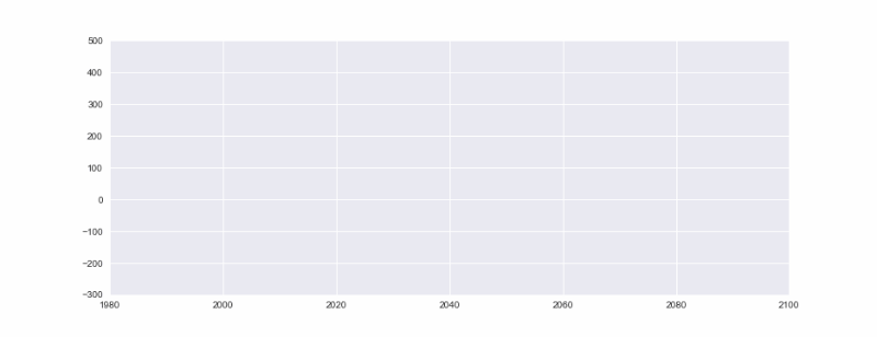
Let’s also start the x-axis from a sensible year for this animation. 1980 might be suitable and we can go up to the beginning of 22nd century. Otherwise, this part is pretty similar to the previous examples.
plt.style.use("seaborn")
fig, axes = plt.subplots(nrows = 1, ncols = 1, figsize = (15,5))
axes.set_ylim(-300, 500)
axes.set_xlim(1980, 2100)
This part is also the same as before, we are creating empty containers, creating the animation function, and inside the function we are filling the empty lists at each iteration and plotting the line charts at each iteration as well which consist of the frames of the line animation.
The exception or difference here is that if you realized we are making use of iteration variable “i” and adding 1980 to that so x-axis starts from 1980 which is the lower limit we defined for x-axis previously.
x1,y1,y2,y3 = [], [], [], []
def animate(i):

    x1.append(1980+i)
    y1.append((l1[i]))
    y2.append((l2[i]))
    y3.append((l3[i]))

    axes.plot(x1,y1, color="red", linewidth=0.5)
    axes.plot(x1,y3, color="blue", linewidth=0.5)
    axes.plot(x1,y2, color="gray", linewidth=1)

anim = FuncAnimation(fig, animate, interval=50)
We will need a lot of CO2 emission performances in near future that looks like the blue line to ensure the conservation and sustainability of our miraculously amazing planet Earth.
Which line does your company’s performance will look like do you think? How about your country? Or your personal CO2 output per year?
Summary
In this animation tutorial we have advanced the previous line chart animation tutorial a little bit.
We used multiple data collections to animate multiple lines with different y-axis values. We created line plots using pyplot for each of them in the animation function. Additionally, we gave them different colors using color parameter and we also adjusted their thickness using linewidth parameter.