
- How to create Plotly animations
- How to save Plotly animations
- How to create Mapcharts – Plotly & Mapbox
- How to create Matplotlib animations
- How to save Matplotlib animations
- Titles, Axes, Ticks & Legend
- Matplotlib Built-in Styles
- Animated Line Charts
- Multi-line Animation
- Stacked Area Charts
- Word Cloud Visualization
- Bar Chart Animations
- Colors with Python
- Creating Multiple Charts
- Creating Hexbin Charts
- Creating Pcolor Charts
Stacked Area Charts
Holy Python is reader-supported. When you buy through links on our site, we may earn an affiliate commission.
Introduction
Stacked charts are a great opportunity to showcase relevant values in the same graph next to each other.
I particularly enjoy analyzing and creating stacked area charts because they show the historical evolution of subjects and we can also see the what the values add up to when combined.
In this visualization tutorial we will learn how to create stacked area charts using Python and Matplotlib.
1- Matplotlib's Stackplot and Python Libraries
stackplot() is the function that can be used to create stacked area charts. It’s usage is pretty straightforward. We need data sequences for x-axis and values that share the y-axis concurrently. It will be something like below:
stackplot(x, y1, y2, y3…)
Let’s gear up the Python libraries we may want to use for this task.
import matplotlib.pyplot as plt
import pandas as pd
import numpy as np
import matplotlib.pyplot as plt
import seaborn as sns
plt.style.use("seaborn")
As usual we will start with the core functions in this tutorial and then make a more advanced example to demonstrate stacked area charts using Python and its libraries.
2- Example 1: Basic Stackplot Example
We will need data for 3 line objects. They can share the same x-axis values and move in sync horizontally but we will need 3 different set of y values for them.
Let’s create some data using List Comprehension and random library’s randint function.
Data:
coal = [8447, 8881, 8886, 9324, 9408, 9124, 9147, 9401, 9716, 9453]
gas = [4761, 4817, 5084, 4978, 5128, 5467, 5695, 5787, 5959, 6186]
hydro = [3422, 3491, 3656, 3797, 3888, 3889, 4032, 4075, 4190, 4246]
nuclear = [2725, 2612, 2434, 2454, 2502, 2536, 2572, 2591, 2657, 2756]
oil = [946, 1060, 1130, 1087, 1045, 1058, 1004, 927, 921, 861]
solar = [32, 63, 98, 136, 197, 256, 328, 445, 578, 711]
wind = [346, 440, 530, 639, 713, 829, 961, 1137, 1265, 1417]

year = [i+2010 for i in range(10)]
Stacked Area Chart:
colors = sns.color_palette("RdBu", 7)
labels=["coal", "gas", "oil", "nuclear", "hydro", "wind", "solar"]
plt.stackplot(year, coal, gas, oil, nuclear, hydro, wind, solar, labels=labels, colors=colors)
Plot Aesthetics:
plt.legend(loc = "upper center", bbox_to_anchor=(1.1, 0.8), ncol=1)
plt.title('Electricity by Source')
plt.ylabel('TWh')
plt.xticks(np.arange(2010,2020,step=1), rotation=40)

plt.show()
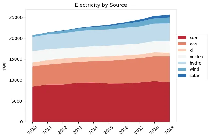
Unfortunately, fossil fuels still consist of the largest group from which electricity is generated and especially coal has a very large share. Wind and solar power generation growth in second half of the decade is encouraging while hydro, nuclear and oil remain stable.
3- Example 2: Evolution of CO2 emissions
We can make a slightly more complex example to demonstrate the true capabilities of Stackplot.
In this example let’s create a stacked area chart using CO2 emission data by different countries and regions or clusters of countries.
This example will be great to demonstrate how insightful and visually aesthetic stacked charts can be.
Basically, the stackplot will work on the same principals as the previous example but we will have a more sophisticated data stream.
You can find the data used below in this link. When we have larger datasets it makes sense to take advantage of Python’s pandas library which offers amazing tools to contain and manipulate data frames data series and matrice.
First we will need to read the csv file obtained from Our World in Data. read_csv function works well for this task. Then we can use Numpy’s unique function to have a collection of unique year values from the data frame. (Because if you open csv you will see that year values are repeated for each country, this would cause a problem of mismatch with y values when we draw the stackplot chart.)
Reading CSV File:
df = pd.read_csv("Desktop/annual-co.csv")
year = np.unique(data['Year'].values)
After opening the csv file and assigning year values to the year variable, we can also work on the y values of the stacked chart.
Below you can see how pandas data frame is filtered to only get the required values for each y-axis object.
For example, first line consist of dataset that will be used to draw China’s CO2 emissions in recent history. You can see that column “Annual CO2 emission” is called where column “Entity” equals “China”.
Similarly we will use CO2 emissions for the US, EU, Africa, India, South America, Oceania and International Transport values.
Data from Pandas Dataframes:
chi = (df[df['Entity']=="China"]['Annual CO2 emissions'])
usa = (df[df['Entity']=="United States"]['Annual CO2 emissions'])
eu27 = (df[df['Entity']=="EU-27"]['Annual CO2 emissions'])
afr = (df[df['Entity']=="Africa"]['Annual CO2 emissions'])
ind = (df[df['Entity']=="India"]['Annual CO2 emissions'])
sa = (df[df['Entity']=="South America"]['Annual CO2 emissions'])
eunon27 = (df[df['Entity']=="Europe (excl. EU-27)"]['Annual CO2 emissions'])
oce = (df[df['Entity']=="Oceania"]['Annual CO2 emissions'])
transport = (df[df['Entity']=="International transport"]['Annual CO2 emissions'])
The rest is pretty much the same but also let’s create a color palette using seaborn library and its color_palette function. Spectral palette should be ideal for this task since it’s a diverging color map that starts with red colors and ends up with blue colors. We can slice it to 9 colors (since we have 9 different stacks) and we can obtain hex codes from it using the code below:
Colors from Seaborn color palette:
palette = sns.color_palette("Spectral", 9).as_hex()
colors = ','.join(palette)

labels = ("China", "USA", "EU27", "EUnon27", "India", "Africa", "transport", "SA", "Oceania")
We’re also including label names to make the stacked chart more meaningful. Now we have many elements of the stackplot ready. We have prepared: data (for x-axis and y-axes), colors (stacked areas) and labels (for countries the make up the stacked areas).
We can finally use the stackplot function with these.
Charting with Stackplot
fig = plt.figure(figsize=(8,5))
plt.stackplot(year, chi, usa, eu27, eunon27, ind, afr, transport, sa, oce, colors=colors, labels=labels)
plt.legend(loc='upper center', bbox_to_anchor=(1.1, 0.8), shadow=True, ncol=1)
plt.xticks(np.arange(1750,2020,step=10), rotation=40)
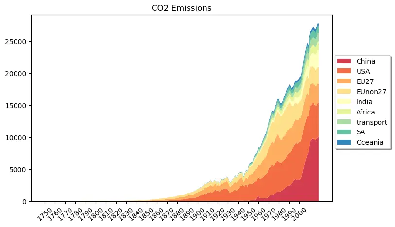
Above, one single stacked chart has so much to say. Here are some points from the chart above:
- Throughout 18th century and first half of 19th century CO2 emissions from human activity was nearly inexistent relative to recent values.
- Total global CO2 emissions have been growing exponentially since 1930s
- China has seen an astronomical surge in its total CO2 emissions since early 2000s.
- India, Africa, South America and International Transport CO2 emissions are other items on the chart that have been growing recently.
Another important question to ask is: “What does this data not tell?”. For example, here we don’t see the emissions per capita which can be an important criteria while evaluating countries’ CO2 emission performance and trend. Also, lots of Asian countries are missing which can be another point to mislead the analysts or readers.
Hopefully, this example was useful for demonstrating stacked area charts. If you liked it or find it useful feel free to share and spread the coding love.
Summary
In this visualization tutorial we learned how to create stacked area charts using matplotlib’s stackplot function.
Additionally we used a few other useful functions such as numpy’s unique and seaborn’s color_palette and pandas’ read_csv function. You can see that high level coding is as much about making use of different libraries and their functions in harmony as it is about coding syntax and logic.
Like spoken languages, programming languages are as useful as you use them for connecting the dots, while building with passion and coming up with creative solutions.
plt.legend and plt.xtick were used to manage legend of the chart as well as ticks on the x-axis (plt stands for pyplot). We adjusted the position of the legend and the rotation of the tick values as well as their frequency and start-end points.