
This Python tutorial provides a detailed and practical step-by-step demonstration of Map Charts or Geomaps.
Geomaps are fantastic visual representation tools for interpreting and presenting data which includes location.
Data at hand that has some kind of location information attached to it can come in many forms, subjects and domains. Some examples are:
- Global events and phenomenon
- War
- Conflict
- Pandemic
- Global warming
- Space data
- Immigration
- Macroeconomics
- Aerial/Flight data
- Nature related events:
- Earthquare
- Tsunami
- Bird, fish, mammals migration
- Solar data
- Wind data
- Precipitation data
- Socio-economic data:
- Trade data
- Housing and Real Estate data
- Jobs
- Wages & Salaries
- Population
- Energy data
- Life Expectancy
- Tourism and culture:
- Festivals
- Voyage
- Celebrations
- Holidays
- Voyage
- Backpacking
- Image data
And the list goes on as we count more and more niche subjects. This type of data sometimes comes fully ready with coordinates but sometimes only location data included will be a city name, county name, country name, province name or open address.
Estimated Time
20 mins
Skill Level
Upper-Intermediate
Exercises
na
Content Sections
In cases where you don’t have a latitude-longitude data available it becomes a joy rather than a chore to tackle this issue with Python.
We have a tutorial about geocoding, which is the process of getting coordinates from a location’s name or address, and reverse geocoding which is getting the address or name of a place from its coordinate points (latitude and longitude). Like most tasks this is handled elegantly in Python with the help of Geopy library.
You can also check out this guide about creating Plotly animations to see some other Visualization options in Python.
Used Where?
- Exploring data
- Presentations
- Business Strategy
- Science and Engineering
- Research
- Financial markets
- Apps & Software
- Websites
You can find the interactive Chart Map at the bottom of this page embedded for demonstration.
Discovering the Map Service and Getting a Free Account
First of all we’ll use Mapbox API key for map services. So it might be useful to take care of that as first step. There are many different map services out there and it might make sense to invest some time and discover different benefits and costs when a commercial application is at hand.
But, Mapbox has a generous free account and it will be perfect for this tutorial.
You can sign up here and get a free account and API key.
We will read the API key from a file you can save as following: (named .mapbox_token with no file extension)
px.set_mapbox_access_token(open(".mapbox_token").read())
Thankfully, Mapbox has a generous free plan so you shouldn’t have to worry about billing unless you have a huge traffic.
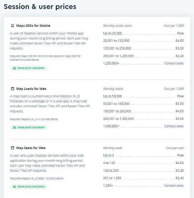
You can find more about the pricing scheme here: Mapbox Pricing.
Creating the map chart w/Plotly (Step-by-step)
Let’s split up the code first and investigate each part for a better understanding.
First you’ll need the libraries:
Prep & Reading Data (libraries, data file, API token etc.)
import plotly
import plotly.express as px
import pandas as pd
API Access Token will be needed as explained above, so, here is the code for that part:
px.set_mapbox_access_token(open(".mapbox_token").read())
Then, also, a data file needs to be opened and read which will be used to create the map chart later. Sorry about the creative file name:
f = 'ddd.xlsx'
df = pd.read_excel(f, index_col=0)
Heart of the operation (Creating figure object)
At this point, we are ready to create the figure object that will represent the map chart using express module of plotly library.
Here are the main parameters that’s used in the creation of map chart:
- df is the first argument representing dataframe containing input data
- lat: latitude data for each data point
- lon: longitude data for each data point
Here are some optional parameters that are used that make the map much prettier and functional:
- hover_name: Defines the data to be shown when mouse pointer is hovered over each data point.
- size: Points to data that sizes are based on
- color_continuous_scale: Applies an appropriate color scale of choice
- size_max: limits the maximum size of each data
- zoom: defines map zoom level upon loading. 1 is for most zoomed out map
fig = px.scatter_mapbox(df, hover_name='location', lat="lat", lon="lon", size="total_deaths_per_million", color="total_deaths_per_million",
                            color_continuous_scale=px.colors.sequential.Rainbow, size_max=30, zoom=2)
Map Styles & Layers (mapbox_style and mapbox_layer)
After that, there are different map styles you can apply to your map. Using mapbox_style is a great way to quickly give style to the map and it will dictate the overall map color scheme (this part is also known as lowest layer or base map). Here are some of the options you can try:
- dark
- open-street-map
- white-bg
- carto-positron
- carto-darkmatter
- stamen-terrain
- stamen-toner
- stamen-watercolor
- basic
- streets
- outdoors
- light
- dark
- satellite
- satellite-streets
fig.update_layout(mapbox_style="open-street-map")
Also layers of the map can be specifically assigned by using an external source. Here is an example using Nationalmap from U.S. Geological Survey’s (USGS) National Geospatial Map.
    # fig.update_layout(
    #     mapbox_style="white-bg",
    #     mapbox_layers=[
    #         {
    #             "below": 'traces',
    #             "sourcetype": "raster",
    #             "source": [
    #                 "https://basemap.nationalmap.gov/arcgis/rest/services/USGSImageryOnly/MapServer/tile/{z}/{y}/{x}"
    #             ]
    #         }
    #       ])
It’s commented out so in case you’d like to give it a try please remember to remove the sharp signs.
Saving map chart locally (plotly.offline.plot)
Finally, you can save the map chart locally as an html file by using the following code:
Just adjust the file path based on your needs.
plotly.offline.plot(fig, filename=r'C:/Users/ABC/Desktop/map_chart.html')Map Chart (Full code)
It’s always a good idea to create a function when code is getting long or whenever it makes sense. This allows coder to not worry about correctness and integrity of each line during the development phase. You can just comment out a single line where you call the function and nothing will be executed.
But there are many more benefits. It also allows easy reproduction, easier reading and gives structure to the overall program.
Here is the full code compartmentalized as a user-defined function for easier use and reproduction:
def vijulize():
    import plotly
    import plotly.express as px
    import pandas as pd

    px.set_mapbox_access_token(open(".mapbox_token").read())

    f = 'ddd.xlsx'

    df = pd.read_excel(f, index_col=0)
    fig = px.scatter_mapbox(df, hover_name='location', lat="lat", lon="lon", size="total_deaths_per_million", color="total_deaths_per_million",
                            color_continuous_scale=px.colors.sequential.Rainbow, size_max=30, zoom=1)

    fig.update_layout(mapbox_style="dark")
    plotly.offline.plot(fig, filename=r'C:/Users/ABC/Desktop/map_chart.html')

vijulize()
If you take a look at the full code, here is a summary of what’s happening:
- First 3 lines inside function imports necessary libraries
- Next authorization is handled with a file which includes our API key
- Next file path including the data is defined
- After that data is read using pd.read_excel
After these pre-figure steps, which mostly handle supportive tasks such as opening and reading data, authorization, libraries etc. there are 3 major steps in the code:
- Creating the figure as an object named fig
- Updating fig with a cool color scheme
- Saving fig using plotly.offline.plot() method
Saving and Embedding Geomaps (Map Chart)
There are multiple methods and ways about saving a map chart created by Plotly. It’s up to you to discover, investigate and choose the method that makes most sense to your work or application.
Map Chart File Embedding Solutions (html format)
Commonly there are 2 distinct methods approaches:
- Saving charts, animations, maps as html, json, png, gif, jpg on local disks. (Offline method)
- Saving charts, animations, maps as html, json, png, gif, jpg on cloud, website or a server such as Chart Stuido, Github, Hosting Service, Dropbox, Google Drive etc. (Online method)
plotly.offline.plot(fig, filename=r'C:/Users/ABC/Desktop/map_chart.html')
<iframe width="900" height="800" frameborder="0" scrollng="no" src="https://holypython.github.io/holypython2/somefile.html"></iframe>
Demonstration
Et voila! Map is ready to be presented. What do you think? Isn’t it beautiful. It’s just amazing how far we came in data visualization in recent years thanks to coding pioneers in the field such as Mapbox, Plotly, Geopy and many other libraries.
What do you think about the map? I found these points particularly interesting at first sight:
- U.S. doesn’t seem to be doing so bad as we’ve seen in this tutorial based on nominal numbers. Belgium is taking the biggest hit by far in that compartment.
- Sweden’s death per million numbers are off the charts compared to its Nordic neighbors Norway, Denmark and Finland. Maybe it’s time to reconsider herd immunity arguments
- Italy, France and the U.K. all seem to have high death per million numbers. Many culprits there likely: elderly population, lack of virutic epidemic experience in recent decades in the area (compared to Asian countries like Japan or South Korea), well established global travel, tourism and trade, transparent and honest case reporting etc. etc.