Most database applications also offer computationally efficient native visualization modules.
In this SQL tutorial we will explore a cool SQLite Visualization feature that can be found on DB Browser for SQLite software.
DB Browser’s plots are particularly pleasant because they are blazing fast to create and also you can scroll on the chart or on the axis values to zoom in on a particular area on the chart, and that also works really fast without any glitch.
Creating beautiful and creative charts are great but when I’m looking for a quick insight or overview on the data in database I really like something that just works efficiently and fast without any interface heaviness. For this purpose charting techniques introduced by DB Browser will be amazing.
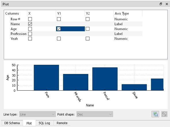
1- Visualizing Family Names and Ages
Let’s start with a simple example. From the Execute SQL tab in DB Browser for SQLite. You can make a simple SQL query like this one below:
select * from Fam
Since this is a tiny database we don’t need to add any filtering statements to our query. Then you can selec Names as X, Age as Y1 and voila, a bar chart will automatically be created.
Family Names and Ages Illustrated on Database
This chart is somewhat interactive and you can drag it with your mouse or scroll in and out for zoom. You can also scroll on the axes which is very useful sometimes.
For a simple Database creation example check out this DB Browser tutorial:
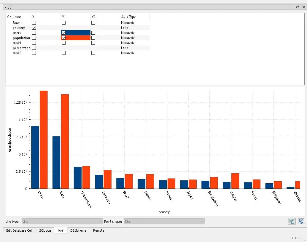
Here we are selecting everything from Intuse table. Then ordering top 10 countries by user amounts (internet users) in descending order.
I selected country as X, users as Y1 and population as Y1 as well. It matters in this case that users and population are both on Y1 axis and not Y1, Y2 because this helps see the gap between population and internet user numbers by having the same proportion for both plot bars. This will create lots of extra room.
select * from Intuse order by users desc limit 10
Top 10 countries by population and internet usage
3- DB Browser for SQLite Plot Window Adjustments
I’d like to mention a few settings I like to adjust to get most out of my database visualization with SQLite and DB Browser.
First of all I like to merge my Plot tab with Edit Database Cell tab to be able to get more space vertically and horizontally in the application. This can simply be done by grabbing the tab by the header and moving it over the other one for merging.
After that, you can also expand the Plot tab section horizontally by dragging it and especially if you have a wide or ultra-wide monitor it provides a very user friendly work space.
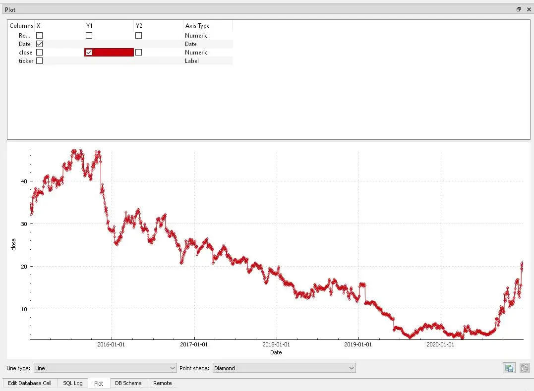
4- Visualizing Time Series on Database with DB Browser
And here I plotted the GME stock which became the symbol of an online financial movement in Feb 2021.
There is one point to be aware of here, you can always select X as Row value, which will place incremental numbers on the X-axis. But to be able to select Date as X, you have to specify date with a name in your query (SELECT date as Date). Otherwise, everything shows as Numeric axis type and charting won’t work properly. (You can see below, above the chart Date has Date as Axis Type.)
SELECT date as Date, close, ticker from Stocks WHERE date BETWEEN '2015-01-01' AND '2021-01-01' AND ticker = 'GME'
Top 10 countries by population and internet usage
This chart is very useful for a quick insight while exploring or managing data.
Summary
In this SQL tutorial we have explored native visualization possibilities on the database using DB Browser for SQLite.